Scooter and Rally Pictures and Videos
Moderator: Modern Buddy Staff
Orange Guy
Member
Posts: 1054Joined: Sat Apr 19, 2008 11:15 pmLocation: Quad Cities
Contact:
Post
by Orange Guy Thu May 08, 2008 3:30 pm
jfrost2
Member
Posts: 4782Joined: Sun Feb 17, 2008 1:32 amLocation: Somewhere in Ohio, Maybe.
Post
by jfrost2 Thu May 08, 2008 3:32 pm
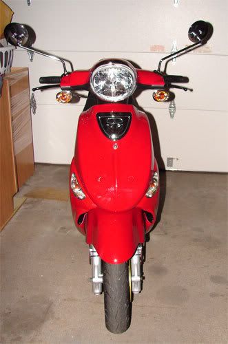
I like it best left alone, your designs are cool, but I think the buddy is too retro looking to touch
Queen
Member
Posts: 176Joined: Tue Nov 20, 2007 5:57 pmLocation: Illinois
Post
by Queen Thu May 08, 2008 3:36 pm
I'm a fan of go big or go home.
Christy
Member
Posts: 689Joined: Sun Feb 03, 2008 2:02 amLocation: Plano TX
Contact:
Post
by Christy Thu May 08, 2008 3:43 pm
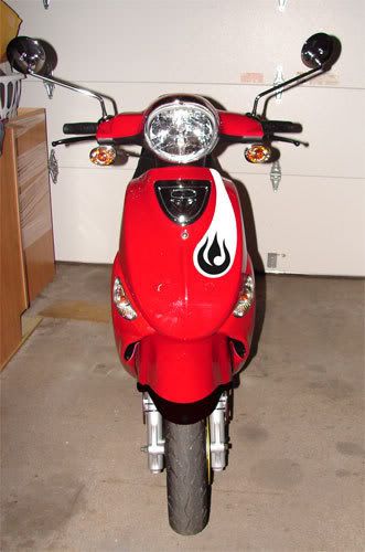
i said #5 but I think i'd like it better without the #2 part...just the black, $0.02
EPSP #76
Orange Guy
Member
Posts: 1054Joined: Sat Apr 19, 2008 11:15 pmLocation: Quad Cities
Contact:
Post
by Orange Guy Thu May 08, 2008 3:52 pm
Christy wrote: without the #2 part...just the black, $0.02
Awwww ... that's the inspiration for the whole thing.
Anybody else watch Avatar: The Last Airbender?
Christy
Member
Posts: 689Joined: Sun Feb 03, 2008 2:02 amLocation: Plano TX
Contact:
Post
by Christy Thu May 08, 2008 3:54 pm
Orange Guy wrote: Awwww ... that's the inspiration for the whole thing.
it's just that I like black...thats all. i think it looks pretty sharp either way.
EPSP #76
Orange Guy
Member
Posts: 1054Joined: Sat Apr 19, 2008 11:15 pmLocation: Quad Cities
Contact:
Post
by Orange Guy Thu May 08, 2008 3:59 pm
brimstone
Member
Posts: 446Joined: Sun Mar 30, 2008 2:07 pmLocation: Juneau, Alaska
Post
by brimstone Thu May 08, 2008 4:06 pm
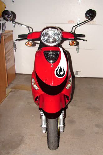
i like 2 or 3. the best of them.
BadBrains
Member
Posts: 183Joined: Fri Apr 18, 2008 11:58 pmLocation: Austin, Texas
Contact:
Post
by BadBrains Thu May 08, 2008 4:10 pm
Number 3 looks super fresh and clean!
SScooterG
Member
Posts: 106Joined: Tue Apr 01, 2008 2:01 amLocation: Houston, TX
Post
by SScooterG Thu May 08, 2008 4:31 pm
Def. #3 - #4's black swoop is kinda unnecessary, and #5 is too busy.
nissanman
Member
Posts: 1209Joined: Thu Aug 09, 2007 4:11 pmLocation: Middletown, CT
Post
by nissanman Thu May 08, 2008 4:59 pm
#3 isn't bad... if you could find some Black reflective tape for the design that would be cool at night. Just my .02
EZPZ #65
EP_scoot
Member
Posts: 760Joined: Mon Dec 10, 2007 3:42 pmLocation: Eden Prairie, MN
Post
by EP_scoot Thu May 08, 2008 6:03 pm
I am with Christy, #5 without the white part as in the later picture you posted.
The OEM blinkers look like eyes and the swoop look like eye brows creating a mean face. Nice
Beer is the answer . . . what was the question?
KRUSTYburger
Member
Posts: 3366Joined: Sun Feb 10, 2008 1:54 amLocation: Pee-Cola, FL
Post
by KRUSTYburger Thu May 08, 2008 6:06 pm
#2!
I say #2, but the front fender would still be cool with something on it... If you do the fender thing, I think it would be better with black and white, not just black. As everyone else said, this just my opinion, but that's the point of this thread right?
pleasefeedthedog
Post
by pleasefeedthedog Thu May 08, 2008 10:25 pm
can you reverse the #5 colors, so that black is white and white is black?
weaseltamer
Member
Posts: 424Joined: Wed Apr 04, 2007 5:20 am
Post
by weaseltamer Fri May 09, 2008 3:23 am
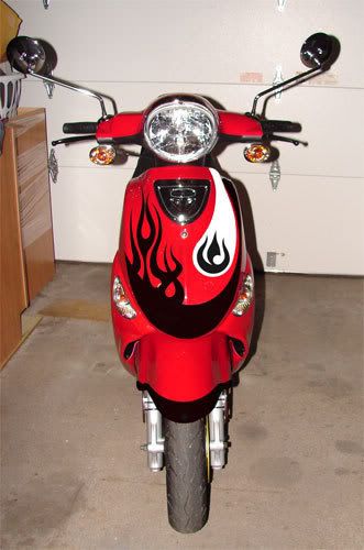
the #2 (white and black thingie) seem a bit too busy for my own taste. the asymmetrical flames though are unique, very cool i say
MarsR
Member
Posts: 351Joined: Fri Apr 18, 2008 3:32 amLocation: Utah Valley
Post
by MarsR Fri May 09, 2008 4:50 am
I like #5. Most of the time it won't be seen straight on anyway, so having a little something on both sides of the shield doesn't really hurt anything IMO.
MB#1749 RBC#8 GOT to get me one of THESE !"Independence Day


